App concept for Transport For London, unifying the current TFL Oyster and Contactless app with navigation functionality. For ease-of-use, the concept is based on a stacked card system, where main features are displayed on their own card and can expand into its own screen if needed.
Self-initiated.
Adobe Illustrator, Sketch & After Effects.
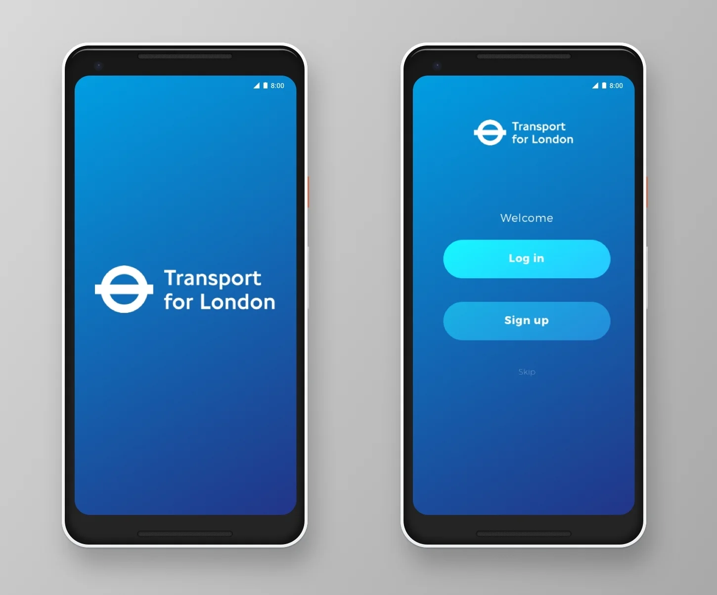
The colour palette is based on existing TFL branding, creating familiarity from the app’s launch. The app offers most functionality to registered TFL customers and guests, with added personalisation once logged in.
A secondary purple colour was incorporated, freshening the brand for its digital presence, complementing TFL’s primary blues.
Once the user is logged in and has linked their bank details with the app, they are able to use the in-built Oyster Tap On function to pay for TFL transport services with their NFC-enabled mobile device. Simply press on the icon when tapping on. A bold, clear display of the user’s balance sits above official Tap On icon and updates in real-time. Options to top-up, view saved trips and access account details are also easily accessible from the Oyster tab.
Cards can slide to give way for new cards or in-app notifications, but never compromise access to cards on lower levels—where features of a card are hidden by a higher-level card, lower-level card headers remain visible, minimising a card into an expandable 'tab’.
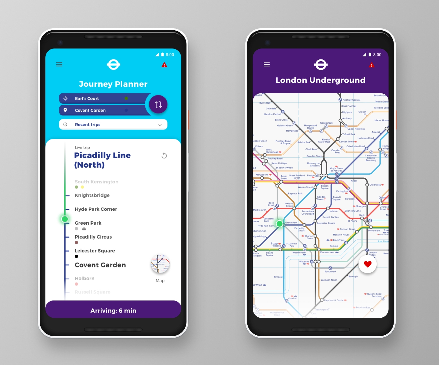
The journey planner follows an intuitive user journey, with the ability to reverse A–B routes, GPS detection of route origin, colour-coded London Underground line markers and a Recent Trips drop-down list for quick-access to frequently-travelled routes. Users can clearly view their journey progress with a bright, animated indicator, see estimated time of arrival to their destination and ability to access a TFL map (on or offline). The discreet, interactive London Underground map screen also displays the user’s estimated journey location, as well as the ability to save/favourite their current route.


